Mobile Phone and Responsive Websites
Mobile
Phone Websites

A large proportion of Internet usage is now done by mobile phones
and tablets. The mobile internet is growing rapidly and most
people now use their mobile handset to access the internet.
According to StatCounter, by
February 2019, UK desktops accounted for 52% of internet usage
compared to 38% for mobile and 10% fortablet.
“This should be a wake up call especially for small businesses, sole
traders and professionals to make sure that their websites are mobile
friendly. Many older websites are not,” commented Aodhan Cullen, CEO,
StatCounter
Is your website mobile phone friendly ?
On a mobile phone screen, some websites are too small
to read. They need to be enlarged and you have to do some difficult scrolling around to find
things. As a result people often
just give up and search for a website that is easier to view.
Mobile phone friendly websites are simpler and easier to see - the text is
instantly large enough to read and you only need to scroll up and
down.
Google favours mobile friendly websites!
You should know that Google now penalises websites in it's search
results that are not mobile friendly.
If you already have a website you can test it on Google's mobile friendly
testing tool -
click here
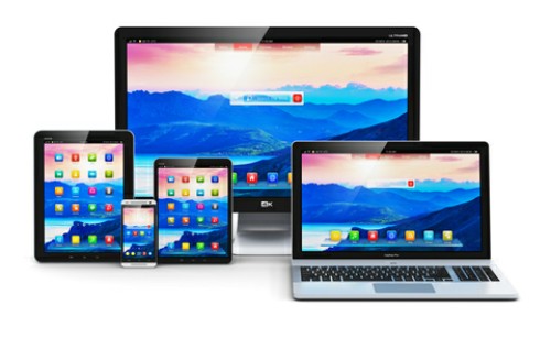
 Responsive Design Websites
A
responsive website is one that changes it's layout depending on the device you are
using. Additional coding allows the website to change it's layout so
that it is of a readable size even on mobile phones, tablets, ipads and takes away the
need to scroll horizontally - regardless of the screen size (see image).
I include full responsive coding with all my new websites.
 Older Websites
that do not have a 'Mobile' version
Converting older websites to reponsive design can be done but may involve completely
recoding it - depending on when it was originally built. Those using 'css'
can be converted, but those that use 'tables' would need a Bespoke Mobile
Phone website.
Bespoke mobile websites tend to be quicker to load than responsive design
websites but need more work to complete.
If you already have an older website, it may be a cheaper option to simply add a
mobile version than to start from scratch with a brand new fully responsive website. The disadvantage is that any updates required need to be done on
both websites.
Other Advantages of having a Mobile Friendly
Website:
Tap to Call
Mobile users can telephone you directly
from their smart phone by simply tapping the phone number on the page - instant contact !
QR Codes
Printed QR Codes look like
big square bar codes - mobile phone users can simply scan the image with
their phone and find your website. Every website has
it's own unique QR Code which when scanned using a mobile phone immediately
connects the user to your website.
Use on business cards, stationery, products, adverts, vehicles, signage -
anywhere. Whenever people see your QR Code, they can simply scan it with
their phone and
your website appears.


 A large proportion of Internet usage is now done by mobile phones
and tablets. The mobile internet is growing rapidly and most
people now use their mobile handset to access the internet.
  Responsive Design Websites
 Older Websites
that do not have a 'Mobile' version